The third Wave Web Winner 2004 (www.com) awards organised by our sister publication, the monthly youth magazine, Wave, took place on 25 February. Of the more than 150 websites submitted, 124 were shortlisted for the final contest sponsored by ITNTI with xtremenepal.com and DVD.com as co-sponsors. Here's our review of the six winning websites:
 Wave Web Winner 2004
Prajjwal Shakya
http://prassanna.150m.com
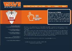
This website not only has class, sophistication and style, it has comprehensibility to boot. Designed in orange and black, it might as well be the official website for the WWW contest. Using the main title package, Prajjwal has laid it out with panache. For those planning to participate next year, check this website out for not just its winning streak but also for the 02 WWW's interview. Add your own formula and who knows, you might be the next Wave Web Winner!
 Best Site-Content
Indira Sharma
www.nepalnari.com
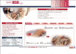
The only female winner of WWW 2004, Indira's done a great job. Designed for the ultimate women with beauty tips, fashion, cuisine and more, it also tackles serious issues that the Nepali nari deals with. While its bulletin Take It Easy shares ideas such as hair damage control, the Nepalnari Special gives an in-depth insight into the situation of Nepali women and how far they've come. It also lists the girls' schools, women's colleges in Nepal and the first Nepali women to accomplish various feats. Interesting and enlightening, this is girl power Nepali-style.
 Editor's Choice Award
Kailash Gyawali
www.klash-design.com
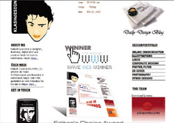
Young and peppy, this is a bilingual website with German and English. Kailash maintains a daily blog giving a firsthand account of a Nepali youth's life in today's Kathmandu. He also posts interesting photos to go with his blog entries. Take a look at the photos of the zoo animals and a photo made up of the letter k. This is more than just design, it is lifestyle.
 Best Site-Technicality,
Chandra Man Maharjan
www.multimedia.com/cmans/
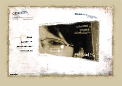
One look and you'll see why this website was a sure-fire winner for this category award. A Flash XML, PHP application, it is creativity at its best and the cute illustrations will keep you occupied even while waiting. The layout and design is just as attractive too. Check it out for yourself. After all, it's only a click away.
 Best Site-Visual Appeal
Shrijit Rajbhandari
www.geocities.com/officialstoopid/
How adorable can scrawls on a crushed page off a spiral notebook be? Visit this website and you'll see. The official site for the band Inside 2 Stoopid Triangles, don't get taken in by the first page though. Inside 2 Stoopid Triangles is a whirl of impressive rebellious adolescent work that belies first impression. It definitely catches the eye!
 Best Site-User Friendliness
Digital Max Team
www.multimedia.com
This website design is simple, elegant and as plain as the nose on your face. It is the perfect website for dummies, first-time and multiple users but it is not exactly boring either. All about how to redesign small businesses to conquer the market through the Internet, this website equips you with all the tools and tricks of the trade. As they say, keep it simple and you just might win!

